Green Side
Roles
Research, Product Design, UX/UI Design, Wireframing, User Testing, Prototyping, Branding
Team
Solo
Timeline
Fall 2024 - 12 Weeks
Figma
Illustrator
Photoshop
Tools
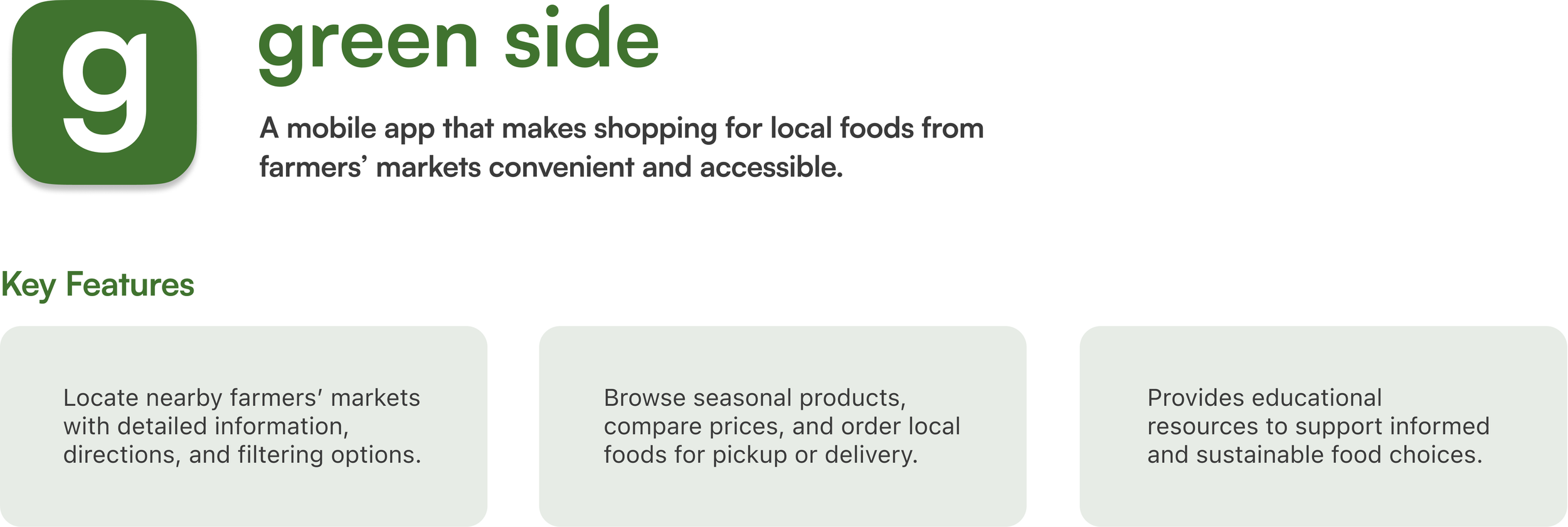
Green Side is a platform that helps users find nearby farmers’ markets to purchase fresh and locally grown foods. Users can browse through available products from local markets and place orders with the option for convenient pickup or delivery to their homes.Product Overview
Context
I was tasked to design and develop a digital product and its branding for a startup company that addresses existing challenges or opportunities in any sector of my choice.Project Brief
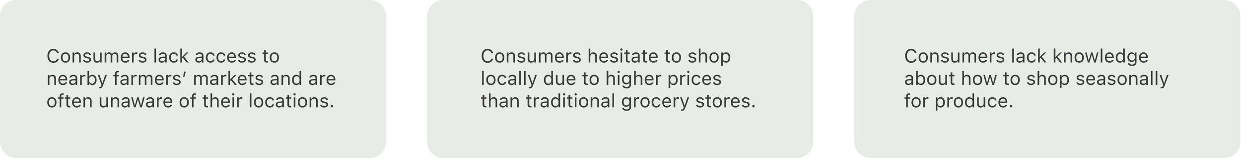
Through secondary research, I recognized that consumers face various barriers to shopping for local foods from farmers’ markets.The Problem
Research & Discovery
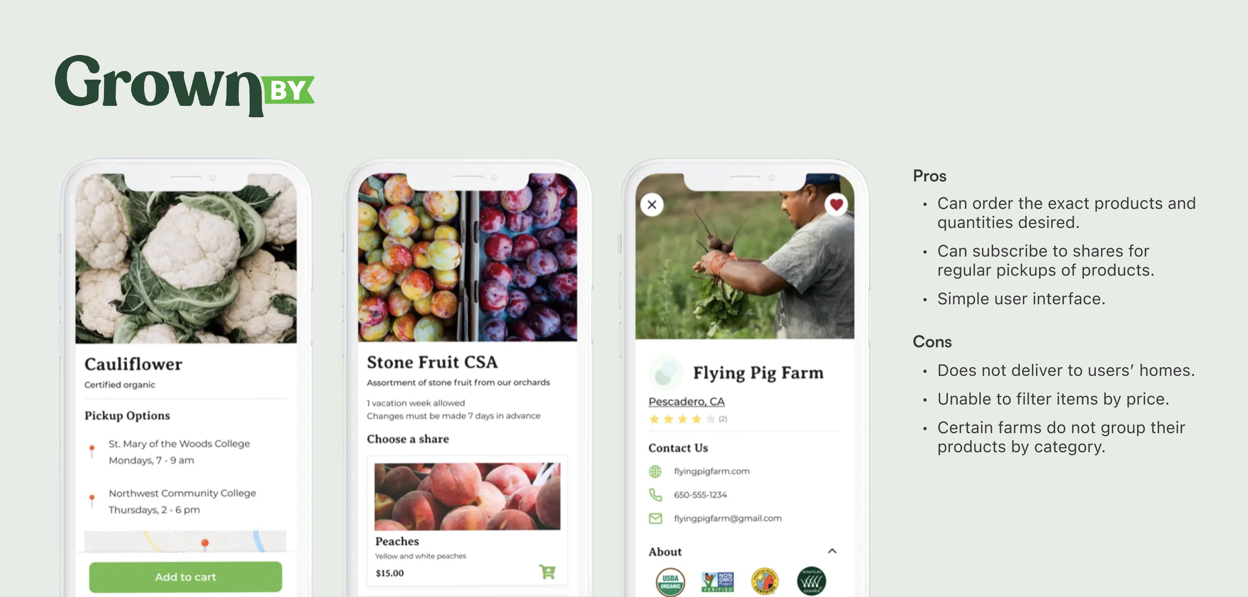
I performed competitive analyses to examine existing platforms and features within the same sector. Platforms like GrownBy and Mama Earth let users order from local markets but lacked pickup and delivery flexibility. I also recognized a lack of filter capabilities, making it harder to find deals and browse products.Competitive Analysis
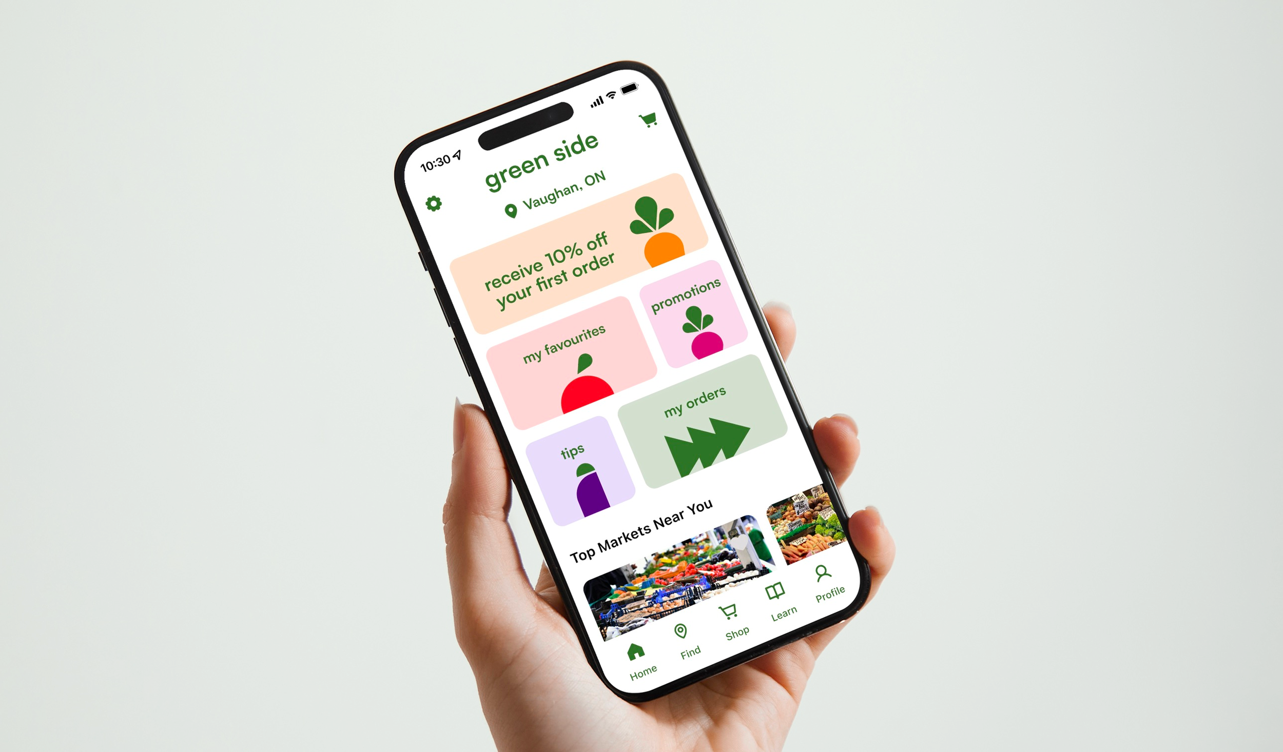
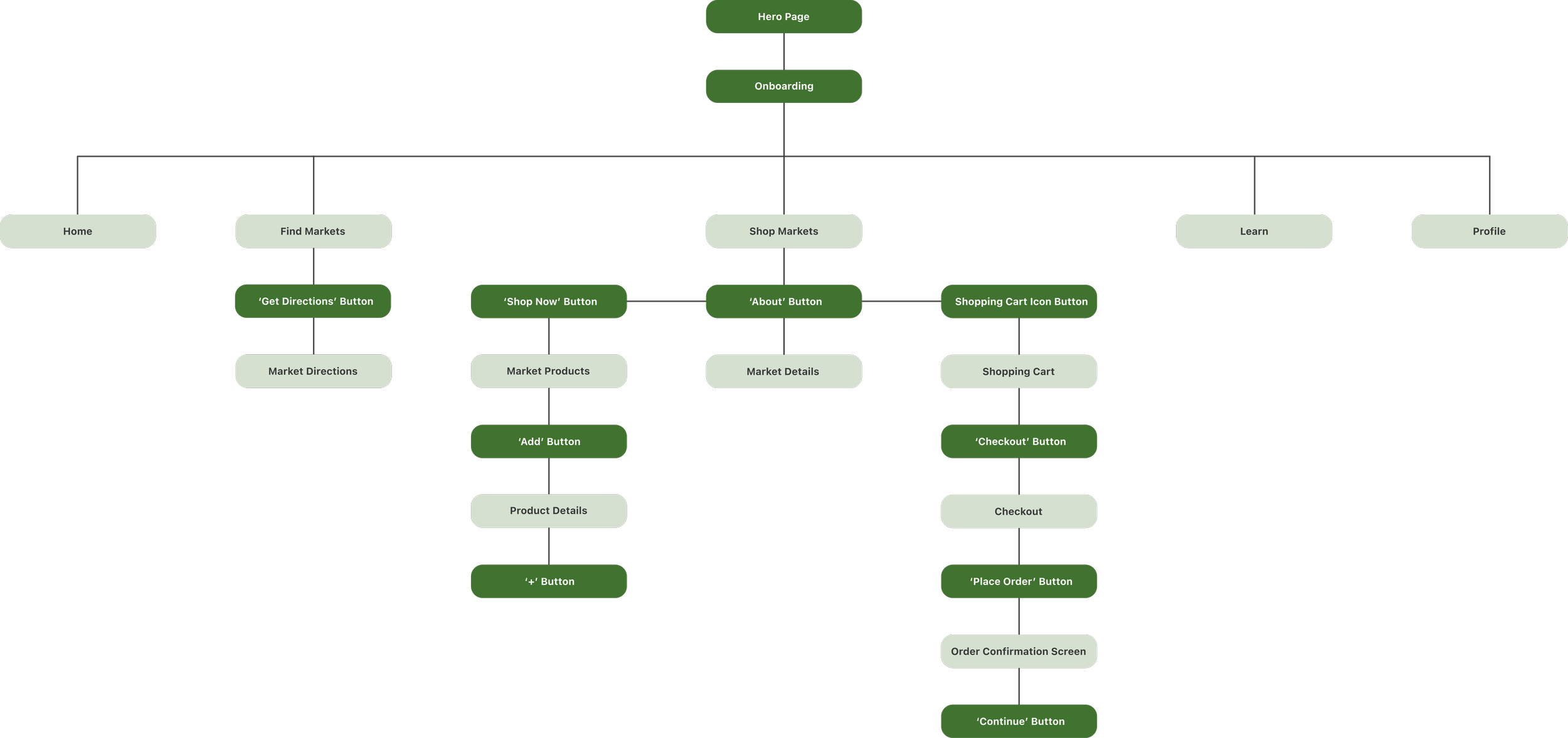
I designed the platform around key navigation sections. The homepage leads to 'Find' for nearby markets, 'Shop' for local groceries, 'Learn' for educational content, and 'Profile' for orders and favourites. This structure ensures convenience, discovery, and a personalized experience.Information Architecture
Solution
Wireframes
I created high-fidelity wireframes to define a clear and intuitive user experience, focusing on layout, hierarchy, and navigation before achieving the final visual compositions.High-Fidelity Wireframes
I optimized the layouts for larger screens while maintaining consistency with the mobile design, ensuring organized content, uniform spacing, and cohesive typography across devices. Using responsive components and Figma’s Auto Layout, I created a flexible system that dynamically adjusts spacing, size, and alignment, to streamline the design process.Web Format
Prototype

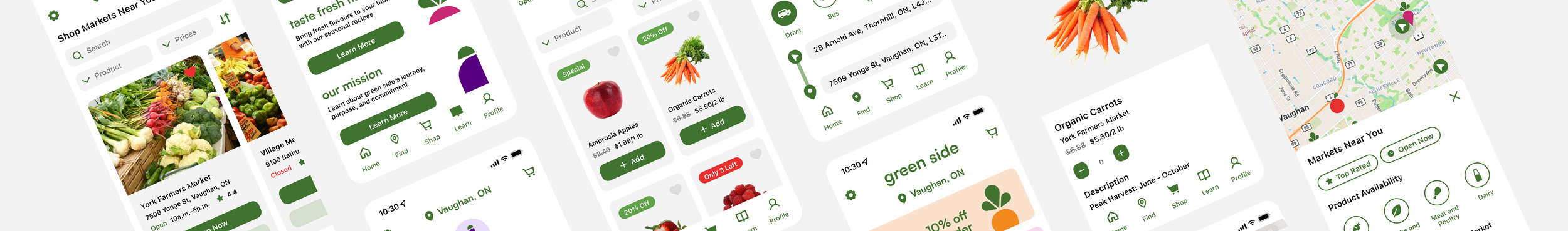
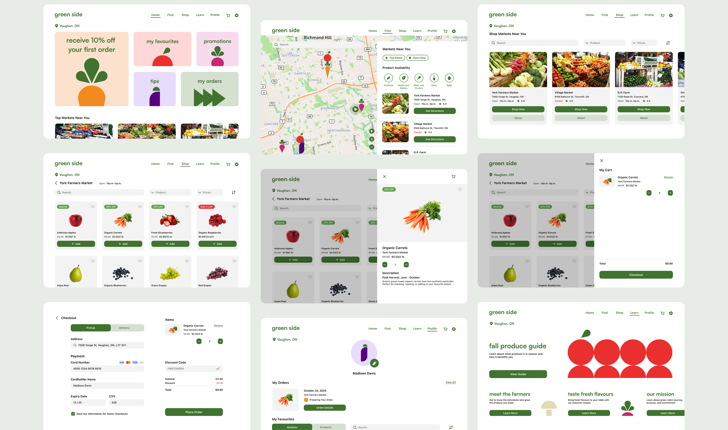
Green Side makes fresh and local produce easy to find and even easier to enjoy by connecting users with top rated markets nearby. Users can navigate under 'Find' to view locations of nearby markets and get directions. Filtering options are available to help users find markets based on rating, operating hours, and product availability.
Find Markets

Whether you are meal prepping or looking to make healthier choices, Green Side makes it simple to browse and order fresh produce right at your fingertips. Users can navigate under ‘Shop’ to browse through the vibrant and seasonal produce of local markets all within their budget with featured deals and price filters.
Shop for Food

Green Side keeps users in the know about what’s in season to ensure enjoyment of the freshest foods available through the 'Learn' section, featuring a produce guide, farmer stories, and seasonal recipes. The 'Profile' section is where users can track current orders, browse order history, and quickly access their saved markets and products.
Educational & Personalized Experiences
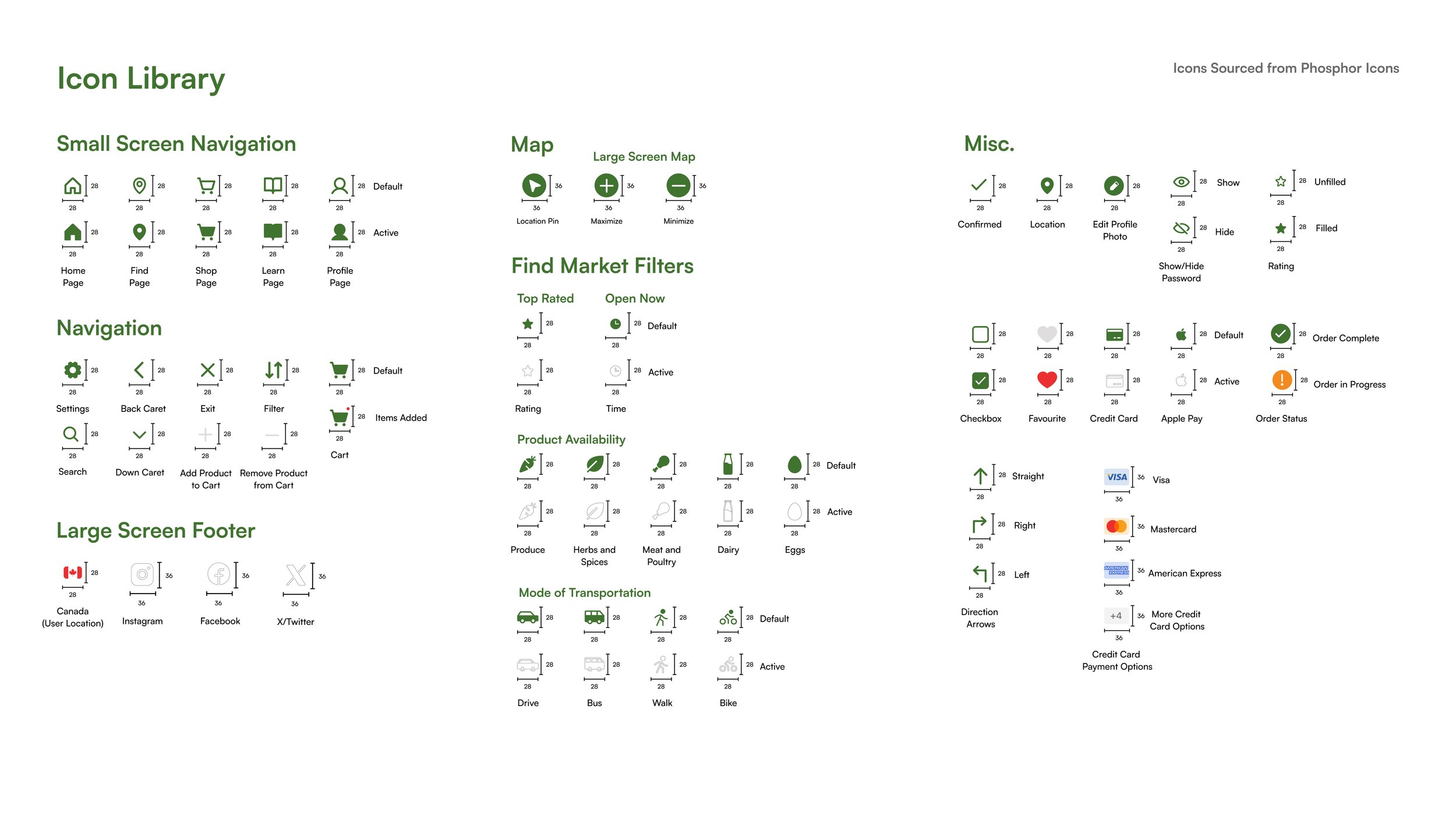
Design System
Green Side’s design system establishes a clean, cohesive interface that supports a seamless and inviting user experience. Accessibility was a key consideration, with thoughtful colour contrast and legible type choices to ensure an inclusive experience for all users.Brand Guidelines


Brand Applications
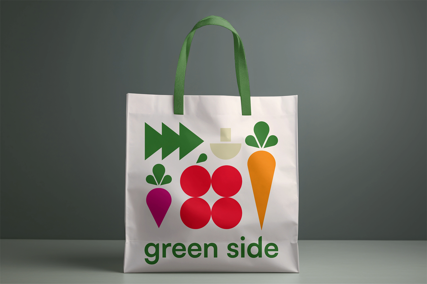
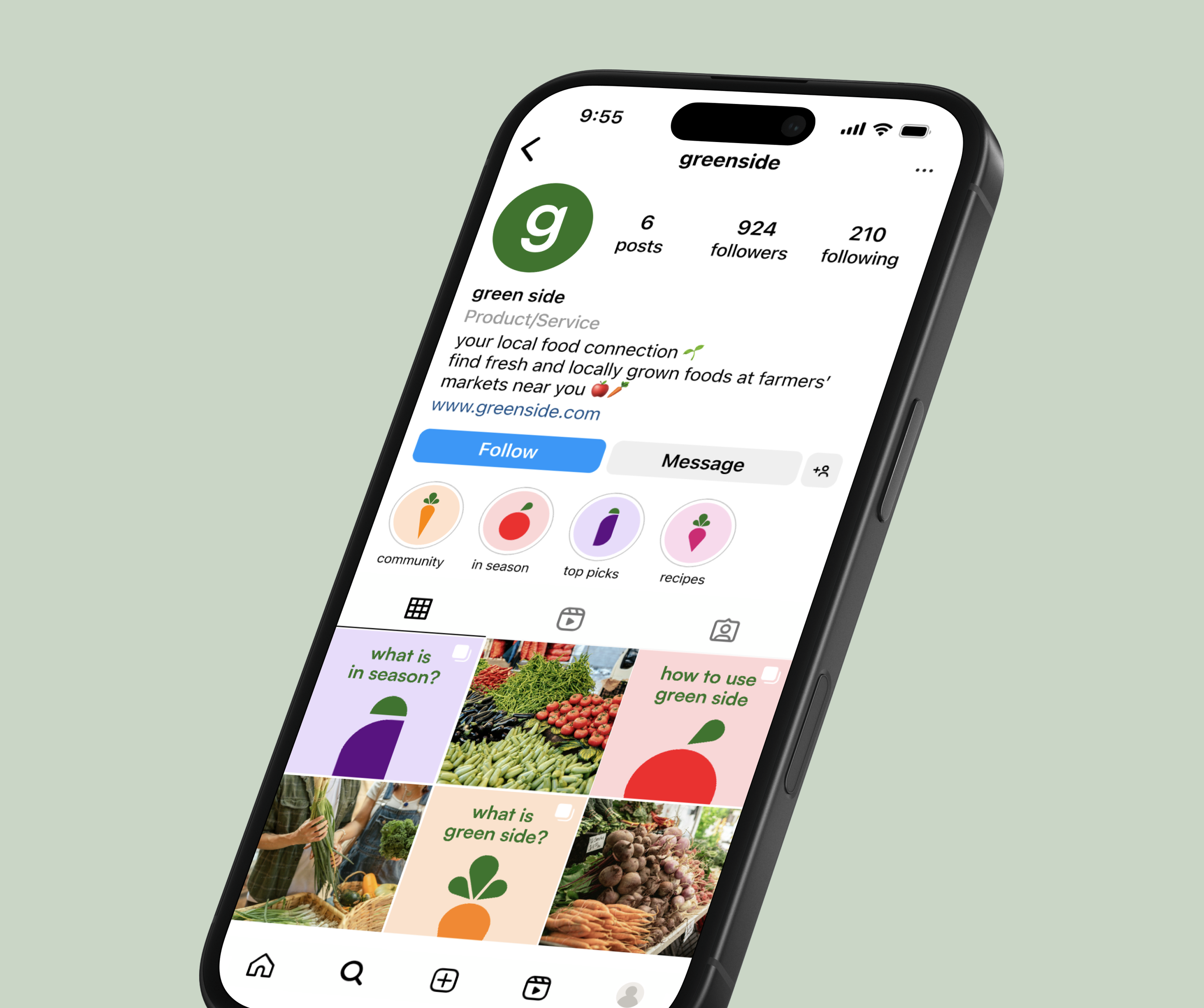
To extend Green Side’s visual identity beyond the digital product, I applied the brand to various print and digital marketing materials, demonstrating how the brand would exist in real-life contexts.Marketing Materials


Key Takeaways
Completing this project emphasized the importance of a thorough design process, ranging from competitive analysis and mid-fidelity wireframes to user testing and final screen designs to reach a simple, user-friendly solution.Design Process
Learning how to create responsive components using Figma’s auto layout feature was a valuable skill that will be useful for future projects to streamline the design process and ensure flexibility.Responsive Design